|
Jerry Goldstein’s grandson Michael has a problem. And he thinks you have one too… Do you suffer from “new sketchbook syndrome?” Are you an art supply hoarder? What about art school? Is it worth it? Have you struggled with pricing your art, or ever wondered why you feel sleepy from watching Bob Ross videos?Michael Goldstein is on a mission to answer these questions, and dozens more, on his YouTube video series “Artist Problems.” But be warned, Michael’s humor is not for the faint of heart. As evident in many of his videos, his use of innuendo and double entendre very closely toe the line of appropriate. “It’s not just about saying shocking things, or getting a rise out of people. It’s about packaging a message in a way that’s funny and memorable. No topic is too taboo.” The Artist Problems series has tackled topics ranging from how to properly clean a brush to dealing with art envy. He has described himself as an “artphrodisiac,” but really he wants to be your creativity coach. You can find all of the Artist Problems video on Jerry’s Artarama’s official YouTube channel here:
0 Comments
iFit, maker’s of a top of the line exercise tracking device had teamed up with CrossFit athlete Christmas Abbott for a new social media marketing campaign called “12 Days of Christmas”. iFit asked Burning Oak Studios to head up the production stage of this project, and we couldn’t have been more thrilled! While Burning Oak has covered dozens of product demos, this particular shoot was sure to be anything but ordinary. The unique nature of this shoot allowed us to stretch our artistic muscles. The result being some really great shots and lighting effects. I carved some time out from my schedule to put together this short highlight reel of this multi-location production. We hope you enjoy! Adam Buccafusco
Great concepts require time and ingenuity – for a creative team, these things go hand in hand. In order for your video or advertisement to stand out amongst the mass amounts of media out there, your video should not only hook the viewer from the beginning, but also keep their attention throughout. It takes time to come up with an idea that will really resonate with your audience – no matter how narrow or broad. So whether you are an organization trying to come up with your own concept or a creative team trying to come to some kind of consensus to pitch to your client, maybe this will help get everyone on board. It’s important to have a creative process for getting the ball rolling. Knowing the core values of a project or the main goal or objective can establish the foundation. Here is where we like to break out a large corkboard, whiteboard, or whatever you can use as a “mood board” to get out ideas, ALL ideas – no matter how big or small. Most will get tossed out as soon as the words hit the Post It, but at least you got it out. You can think of this like free association writing where you write down whatever comes to mind – this can be words, phrases, images. The goal here is to have this trail of thoughts that will hopefully guide you in different directions – with any luck somewhere you haven’t been before. The list could go on forever, but at some point, the stronger concepts will stick out. If you’re working in a group, this allows you to bounce ideas off of one another, and create an even larger list of concepts and if you’re lucky cover every end of the spectrum. By creating volume in your list, you allow yourself to expand the range of ideas – ideas that could be closely related to your goals or not even close. Sometimes the best ideas come from way out there. On the other hand, we also have to learn as creatives that most of our ideas will not come to fruition. Now, it’s time to take the strongest ideas and visually define them – whether that be through a mood board or actually creating rough sketches or a storyboard. Put yourself in the scene and shift the point of view. Telling the same story from a different perspective or with a distinctive theme can add an entirely new twist to the concept. This will be the most effective way of communicating your ideas. Once you have a clear understanding of all of your ideas and a refined sketch of each, it’s probably time to present. Here is where we circle back to the core values and establish how these concepts achieve our goals and reach the necessary audience. Take ownership in your ideas and show that you have done your research, prepare multiple concepts for decision makers, and don’t be afraid to think a little more outside the box than usual. Some of the best ads come from the craziest concepts. Olivia Turnage @laughlivlove Apple announced their new Apple TV. Along with the news came the statement from company CEO, Tim Cook, “We believe the future of TV is apps.” I respectfully disagree, or at least disagree under the definition of television, as it exists today.I imagine Apple’s future of the television is more of a hybrid experience between on-demand entertainment, shopping, and information through applications. A merger between television and computer that is more intuitive and user friendly than hooking a TV monitor up to your computer, or those bizarre internet TV keyboards you could find in hotel rooms. The best definition of modern TV I have found is as follows, a device that can broadcasts programming, record to a DVR, and offers shows that are available on demand through. I believe future changes would mirror more that of the music and movie industry.
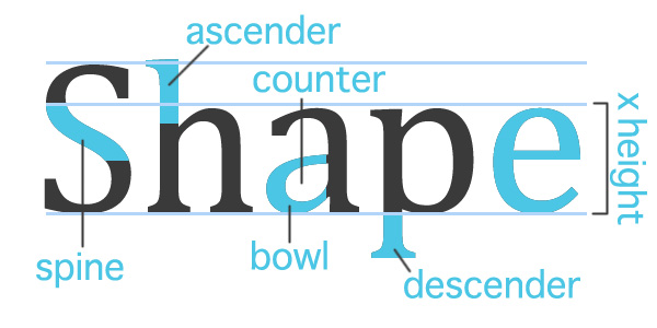
Less than a generation ago, if I wanted to purchase a song, it was assumed I would be going to a retail store, paying upwards of $20, and purchasing the entire album including the desired song. Along comes iTunes a few years later. A way to buy and download any song you want from the comfort of your computer, and NOT have to buy the entire album. Although I don’t believe it was necessarily Apple who first offered songs, legally at least, al a Carte, it planted a seed in people’s minds. It was the inception of “I should only have to pay for what I want.” Today cable and satellite providers want to overwhelm you with “value.” Their front loaded promotions promise you the moon and stars. For only $24.99 a month- you can watch over 200 channels! For the first 12 months of course, some exclusions apply, void where prohibited, offer not valid in Canada. Well, I don’t need or even want 200 channels. I want the basics (which are free anyway over digital antenna) ESPN, and HGTV for my wife. That’s about all I need. I want to be able to watch them on demand too. If television as we know it today wishes to continue, I think they might find themselves forced to pus more al a Carte offers, just like the music industry of the 90’s. After all, there is very little programming that people really care if they watch live (news and sports really), and companies like Netflix and Hulu are giving people an out of their cable and dish handcuffs. For Apple’s future of TV to come true, all cable and satellite providers really need to do is the same thing they continue to do. With no change to how the system functions, I see companies like Time Warner Cable and Dish Network going the way of the dodo bird within a decade. People will be clicking on the CBS app on their Apple TV to watch The Big Bang Theory-that will still be on in 10 years, right? To learn more about cutting your cable, please hop over to a brilliant blog post by our own Will Campbell. Michael Goldstein Everyone should know something about typography, the style and appearance of printed matter. Carefully crafted lettering could set off a band’s banner, a bake sale's flyer, even a bank's commercial. Choosing the right typeface, scale, and placement, ensures a message is communicated clearly while working withina the style and emotion you are trying to invoke.
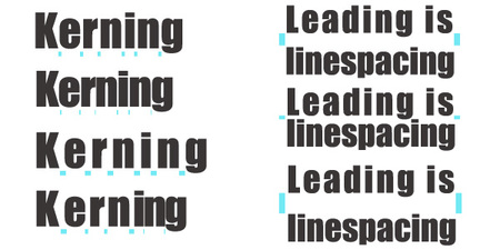
Things to Keep in Mind When Designing: 1) Know when is the right time for a specific typeface. If you have a lot of text to communicate like an information packet, use easy to read fonts such as Helvetica or Times. Your titles can stand out with some typefaces that play to your audience. You may want to stay away from bold san serifs if you are advertising a day spa, instead try a more script typeface. The shape of your type can affect the attitude of your message. Be sure to keep with your branding guidelines or theme. 2) Kern with care. Kerning can help shape your text box in a layout, but use caution! It doesn’t take much before your letters start running away from you. 3) Limit your type choices. Not every word needs to be emphasized by a different typeface. A lot of unique fonts will compete for attention and the message could be lost in all the visual noise. A good rule of thumb is three typefaces, a title, subtitle and text. Rules can be broken, but let’s no get carried away. 4) Type can be artistic and fun. Remember your elements of design when you have some freedom to play with text. Line, shape, form, color, value, texture, and space can be utilized to craft an eye catching, emotion-evoking image. If you are interested in learning more about the art of letters and layouts the following are a couple of links to blogs, books, and series I recommend. Designing with Type http://www.amazon.com/Designing-Type-5th-Essential-Typography/dp/0823014134/ref=sr_1_1?s=books&ie=UTF8&qid=1441731894&sr=1-1&keywords=designing+with+type Design Shack | 8 Rules for Creating Effective Typography http://designshack.net/articles/typography/8-rules-for-creating-effective-typography/ Calligraphy Corner http://www.calligraphy-corner.com/ Adam Buccafusco @adambuccafusco In video production it’s not uncommon to work with a small crew, or even go one-man-band style. You don’t always have the “luxury” of filling one specific role (at least outside of the film unions, that is). Personally, I prefer wearing multiple hats and filling different roles on set. Aside from just being great experience, it also provides a deeper insight and understanding of the semi-complex ecosystem that is a film set. Each role and task is an integral part of the production as a whole. I began my foray into video production with an interest in editing. It wasn’t long after I found myself as a PA on set. Then working with lighting, setting up and manning the camera, mic-ing up talent or holding a boom, directing a shoot – these all have their own technical video-jargon titles (gaffer, grip, best boy, etc.), but that’s worthy of an entirely different post. I’ve recently taken on the mission of exploring the world of audio recording and editing. Audio quality can quite often make or break a video, so no pressure, right? I’m no stranger to mounting a microphone on a camera and pointing in the right direction, patching into a soundboard and just hitting record, or using handheld mics for those late-night karaoke sessions – but I’ve recently discovered how expansive the world of audio production can be. Well, to be honest, each role on set has it’s own sort of world within a world, but I’ll save some of that for later. For now, I’d like to share some of the basics I’ve learned about audio, starting with the different types of microphones. In an attempt to keep this post from turning into a textbook, I’m only going to talk about the three major types of microphones and pick-up patterns.
 Again, there are plenty other types of microphones out there, all with their own benefits and specific applications. Not to mention, there are also wired and wireless versions of all of these. But before you can really choose which microphone you need, you really need to understand how the microphone works. No, not the internal electronics and technology. Rather, how and where the mic is going to pick up sound, and just as important, where it will not – also known as the pick-up pattern. Once again, I am going to simplify this down to three basic patterns.
Understanding how these microphones work will really help determine which type of mic is best for any given situation, but it takes practice and a skilled ear to really perfect audio production. Regardless of which mic you are using, a quality pair of headphones is crucial! Be prepared to constantly monitor recording levels. Listen, not only for the sound you are supposed to record, but also for anything else that might be captured (distant traffic, or a phone ringing). And if you want to be a boom operator, practice by holding a heavy stick over your head for hours at a time.
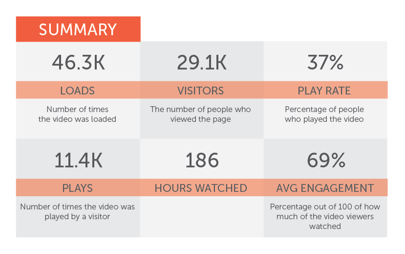
And there you go… With this brief and shallow understanding of microphones, you can now call yourself an Audio Engineer. Quiet on set! Will Campbell Production Manager @SurvivorWill How many views does it take for a video to be considered viral? For large companies, nothing less than a million maybe and for small businesses, a couple thousand views and everybody is happy. For a lot of marketers, the focus is the view count. But if you really want to know what’s driving your video campaign, you have to dig a little deeper. When it comes to your video being successful and getting you results, you want to look at more than just the view count. What the view count isn’t telling us… When we look at the view count, what we can’t see is exactly who is watching. If over half of your total views were not your target demographic, then those views were essentially worthless. You might get a few converts, you never know, but the goal is for your video to reach the right crowd. The view count also doesn’t tell us if the message is working. Instead, you have to look at how long people are watching the video. If most of your viewers make it all the way to the end, that’s a pretty good sign that you have an effective message. On the other hand, if a higher number of viewers drop off that’s an indicator that something isn’t right. Looking at these numbers can help us with determining the best form of delivery for your message and/or figuring out the best place for your video to live. Video metrics you should be looking at…
Ideally you want to know who is watching so you can start the conversation. A professional player will match IP addresses of viewers with the email addresses in your system. This way you can see who is watching what videos and focus the conversation on topics that are hopefully more relevant to that customer. The play rate. This number comes from the percentage of people who actually clicked play to watch your video, divided by the total number of people who visited the page where the video lives. It gives us more insight as to whether your video is actually appealing or not. I wouldn’t want to see a play rate below 50%, especially on a page where the video is front and center. A high play rate suggests that the thumbnail is enticing, the description of the video is accurate, and the content is worthwhile. Ok, so obviously we want our viewers to watch the entire video. But we know that doesn’t always happen. The average engagement will tell you the average amount of time your viewers are watching your video. If a significant amount of people only watch the video for 3 seconds before moving on to something else, then you know your video does not have the impactful hook it might need. This also shows where people chose to re-watch the video, so you can tell if there was something that attracted a lot of people’s attention at that time. Your video is the icebreaker, now start the conversation! When the comments start rolling in, you know you’ve got good content. And when your audience is sharing your video, you can give yourself a pat on the back. Your community is engaged and participating in the conversation. Job well done! Now with all these people on your site and watching your videos, how many people are actually following your call to action? Ultimately, we want to know if our video is helping us make the sale. This can be a little tricky depending on what kind of business you are and what you sell. So you may have to do a little testing of your own. If a product page displays testimonial videos of happy customers, are viewers more likely to purchase? Do the sales numbers change at all if you have an explainer video about how to use the product instead of testimonials? If you’re offering a service, try testing a newsletter sign-up around the video. Alright, so there you have just a few basic video metrics you can monitor to see how your video campaign is doing. You’ll also want to keep an eye on how long people are spending on each page of your website. The pages with the most view time have the most appealing content. And the pages with a decreased bounce rate means your video made people want to look for more! If you watch the right metrics, you can use video strategically to accomplish your campaign goals. So in terms of virality and number of views, sometimes it’s better to focus on quality over quantity. Robert Downy Jr. in Iron Man For those of us who enjoy a great comic book based movie, but were not comic readers, the idea of an Iron Man movie seemed... out of place. Looking at the history of Marvel and DC movies, film adaptations were made on the best-known characters. I’m talking about super heroes known by non comic book readers because they are everywhere. Superman, Batman, Spiderman, Hulk and the X-men, are all examples of comic book heroes who had a huge following outside of their comic book pages. From multiple film adaptations, to TV shows, to pajamas, you knew these characters to some degree, because they were just about everywhere. Disney announced a new super hero movie, Iron Man, would be their next summer blockbuster, and I was confused. At the time of the announcement I knew of Iron Man. I had heard his name before. I could pick him out of a line up. I’m not entirely sure I knew his real name was Tony Stark, or that he had a goatee. As quickly as it was announced, I had pretty much forgotten about it. (I mean they announce these things over a year in advance!) A few months later, I am sitting in the movie theater and the first trailer for Iron Man comes on. I find myself suddenly intrigued. Amidst the explosions and huge actions sequences, it’s the few dialogue pulls they show of Robert Downy Jr. that get my attention. What the heck? He kind of seems like a jerk. He’s cocky, sarcastic, and made me laugh. This is not Clark Kent or Bruce Wayne. This is not what I would imagine a hero to sound or act like. This is a movie I need to check out! When Iron Man finally came out in theaters, I was not disappointed. It delivered on all levels. Story telling, action, humor, and heart. What made this movie different from all other super hero films though, was that I was greatly enjoying the scenes of Tony Stark out of the Iron Man suite, than in. Robert Downy Jr.’s personification of Tony Stark made it the very first, and to this day only, super hero film where I enjoy seeing our hero “in his streets” more than in super hero mode.
RDJ made me believe that this character could exist. He put together the whole package. Sure, there are other actors that are funny and could pull off the comedic timing and sarcastic tone to make the movie funny. I think of actors like David Duchovny, or perhaps director John Favreau’s old buddy Vince Vaughn. But even Favreau knew that the role needed more than just the humor. RDJ brought the right amount of humor, physical presence, and humility to the role to bring Tony Stark to life in a way that got the entire world to know he is Iron Man. Now, let’s see if Paul Rudd can do the same for Ant Man. Michael Goldstein Jack Nicholson in The ShiningStephen King’s novel, The Shining, is in many ways a very different story than the movie we all know. In his own words, Stephen King once had this to say regarding the film: “I don’t get it. But there are a lot of things that I don’t get. But obviously people absolutely love it, and they don’t understand why I don’t,” he tells Rollingstone. “The book is hot, and the movie is cold; the book ends in fire, and the movie in ice. In the book, there’s an actual arc where you see this guy, Jack Torrance, trying to be good, and little by little he moves over to this place where he’s crazy. And as far as I was concerned, when I saw the movie, Jack was crazy from the first scene.” King really hit the nail on the head regarding the leading man, Jack Torrence. What made the book truly spectacular and disturbing was the slow transition from a normal dad to a monster. Whether you have read the book or not, I don’t think many would disagree that in the movie, at no point would we consider Jack Torrance a good guy or at least show any redeeming qualities. So, if the leading role was the cornerstone of the story’s arc, and it was Nicholson who portrayed Jack Torrance, it would seem like I have talked in a bit of a circle. After all, it was Nicholson’s early distant and distracted persona that left the transition of Jack Torrance without a huge character shift. That character shift, or transition, is what really builds the tension and the conflict within the story of The Shining. So how does an actor get the intended character wrong, but get the movie right? The answer is intensity. Nicholson brought to life a character with such ferocity and heat that it’s almost impossible to ignore. This intensity can be seen not only in the film, but also in behind the scene clips. Watching Nicholson prep before a scene, you can feel the energy and passion radiating out of him. Here’s an interesting trivia fact about the filming of The Shining. During the famous scene where Jack Torrance is taking an axe to the bathroom door where his wife has taken refuge, show producers had placed hollow prop doors for Nicholson to hack his way through. It turns out, that Nicholson had experience firefighting, and the doors would break through rather anticlimactically.
They had to ultimately replace the prop door with a solid wooden one. This not only led to a much more realistic and suspenseful action sequence, but also allowed for Nicholson to create a more authentic and adrenaline pumping scene. It was in the heat of that moment that Nicholson went off script and said the most iconic line of the film, “Here’s Johnny!” This improved line, inspired by the actor and the real physical exertion of the moment, would become part of the movie’s fame. It was featured in the original trailer, and to this day is more commonly associated with The Shining than it’s origins on The Tonight Show. Like The Dark Knight and several other movies I will mention in future posts, I am in no way saying these films would have been unsuccessful without these actors. What I am saying is there is a huge difference between a film being a financial success and a classic. Michael Goldstein -- Every design starts with a digital canvas or art board. These are the digital open worlds of possibilities that need to be filled with ideas, colors, and imagery. A lot of non-designers just know they need an ad drafted up and struggle with communicating the specs of the design. The following is an easy way to understand resolution and dimensions which may help with future communication issues. What is DPI?DPI stands for dot per square inch. The higher the DPI the more visual information is being stored thus the more pixels. The more pixels like longer the loading time, but the image is sharper with more pixel variations creating bolder images. For the most part the internet uses 72 DPI to ensure images load quickly, where as print typically is set for 300 DPI so your printed products come out sharp and colorful. Resolution V. Dimensions The best way to think about resolution (in my opinion) is to think of visual information as a liquid. If you have a cup of blue liquid (pixels) and you want it to fill a gallon jug (dimension) it simply won’t. Sure, you can slosh the water around distorting it’s size and shape to give the jug the appearance that it is full, but it’s just blurry and doesn’t look right. To fill a gallon jug you need a gallon or more of blue liquid. If some spills out, that’s fine we call that “bleed” and will cut off in the end. Keeping with this analogy, the blue liquid can be poured from the gallon into a cup without loosing quality or color, it can also be concentrated down to a cup. To sum it up, high-resolution images can be reduced down, but low-resolution cannot be scaled up without losing quality. Sizing ImagesIf you have a set amount of square pixels utilize a smaller DPI will yield a larger image. If you have 300px x 300px that would be 90,000 square pixels so 72 DPI will have a 4.167” x 4.167” square where as 300 DPI would be would be 1” x 1” square. Adam Buccafusco
|
OAKNOTESCategoriesArchives
February 2018
|










 RSS Feed