|
Apple announced their new Apple TV. Along with the news came the statement from company CEO, Tim Cook, “We believe the future of TV is apps.” I respectfully disagree, or at least disagree under the definition of television, as it exists today.I imagine Apple’s future of the television is more of a hybrid experience between on-demand entertainment, shopping, and information through applications. A merger between television and computer that is more intuitive and user friendly than hooking a TV monitor up to your computer, or those bizarre internet TV keyboards you could find in hotel rooms. The best definition of modern TV I have found is as follows, a device that can broadcasts programming, record to a DVR, and offers shows that are available on demand through. I believe future changes would mirror more that of the music and movie industry.
Less than a generation ago, if I wanted to purchase a song, it was assumed I would be going to a retail store, paying upwards of $20, and purchasing the entire album including the desired song. Along comes iTunes a few years later. A way to buy and download any song you want from the comfort of your computer, and NOT have to buy the entire album. Although I don’t believe it was necessarily Apple who first offered songs, legally at least, al a Carte, it planted a seed in people’s minds. It was the inception of “I should only have to pay for what I want.” Today cable and satellite providers want to overwhelm you with “value.” Their front loaded promotions promise you the moon and stars. For only $24.99 a month- you can watch over 200 channels! For the first 12 months of course, some exclusions apply, void where prohibited, offer not valid in Canada. Well, I don’t need or even want 200 channels. I want the basics (which are free anyway over digital antenna) ESPN, and HGTV for my wife. That’s about all I need. I want to be able to watch them on demand too. If television as we know it today wishes to continue, I think they might find themselves forced to pus more al a Carte offers, just like the music industry of the 90’s. After all, there is very little programming that people really care if they watch live (news and sports really), and companies like Netflix and Hulu are giving people an out of their cable and dish handcuffs. For Apple’s future of TV to come true, all cable and satellite providers really need to do is the same thing they continue to do. With no change to how the system functions, I see companies like Time Warner Cable and Dish Network going the way of the dodo bird within a decade. People will be clicking on the CBS app on their Apple TV to watch The Big Bang Theory-that will still be on in 10 years, right? To learn more about cutting your cable, please hop over to a brilliant blog post by our own Will Campbell. Michael Goldstein
2 Comments
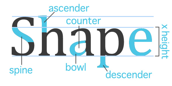
Everyone should know something about typography, the style and appearance of printed matter. Carefully crafted lettering could set off a band’s banner, a bake sale's flyer, even a bank's commercial. Choosing the right typeface, scale, and placement, ensures a message is communicated clearly while working withina the style and emotion you are trying to invoke.
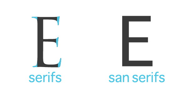
Things to Keep in Mind When Designing: 1) Know when is the right time for a specific typeface. If you have a lot of text to communicate like an information packet, use easy to read fonts such as Helvetica or Times. Your titles can stand out with some typefaces that play to your audience. You may want to stay away from bold san serifs if you are advertising a day spa, instead try a more script typeface. The shape of your type can affect the attitude of your message. Be sure to keep with your branding guidelines or theme. 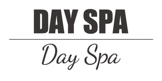 2) Kern with care. Kerning can help shape your text box in a layout, but use caution! It doesn’t take much before your letters start running away from you. 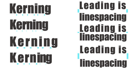 3) Limit your type choices. Not every word needs to be emphasized by a different typeface. A lot of unique fonts will compete for attention and the message could be lost in all the visual noise. A good rule of thumb is three typefaces, a title, subtitle and text. Rules can be broken, but let’s no get carried away. 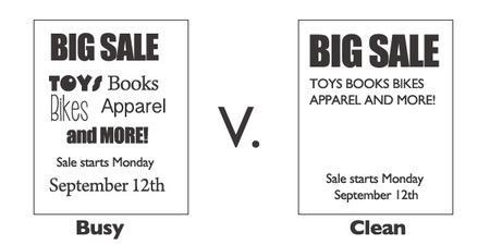 4) Type can be artistic and fun. Remember your elements of design when you have some freedom to play with text. Line, shape, form, color, value, texture, and space can be utilized to craft an eye catching, emotion-evoking image.  If you are interested in learning more about the art of letters and layouts the following are a couple of links to blogs, books, and series I recommend. Designing with Type http://www.amazon.com/Designing-Type-5th-Essential-Typography/dp/0823014134/ref=sr_1_1?s=books&ie=UTF8&qid=1441731894&sr=1-1&keywords=designing+with+type Design Shack | 8 Rules for Creating Effective Typography http://designshack.net/articles/typography/8-rules-for-creating-effective-typography/ Calligraphy Corner http://www.calligraphy-corner.com/ Adam Buccafusco @adambuccafusco |
OAKNOTESCategoriesArchives
February 2018
|

 RSS Feed