|
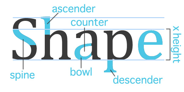
Everyone should know something about typography, the style and appearance of printed matter. Carefully crafted lettering could set off a band’s banner, a bake sale's flyer, even a bank's commercial. Choosing the right typeface, scale, and placement, ensures a message is communicated clearly while working withina the style and emotion you are trying to invoke.
Things to Keep in Mind When Designing: 1) Know when is the right time for a specific typeface. If you have a lot of text to communicate like an information packet, use easy to read fonts such as Helvetica or Times. Your titles can stand out with some typefaces that play to your audience. You may want to stay away from bold san serifs if you are advertising a day spa, instead try a more script typeface. The shape of your type can affect the attitude of your message. Be sure to keep with your branding guidelines or theme. 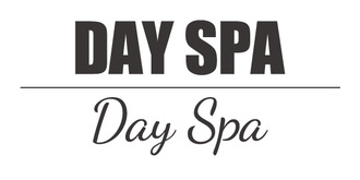 2) Kern with care. Kerning can help shape your text box in a layout, but use caution! It doesn’t take much before your letters start running away from you. 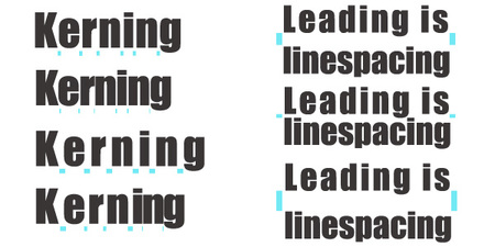 3) Limit your type choices. Not every word needs to be emphasized by a different typeface. A lot of unique fonts will compete for attention and the message could be lost in all the visual noise. A good rule of thumb is three typefaces, a title, subtitle and text. Rules can be broken, but let’s no get carried away. 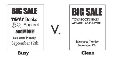 4) Type can be artistic and fun. Remember your elements of design when you have some freedom to play with text. Line, shape, form, color, value, texture, and space can be utilized to craft an eye catching, emotion-evoking image.  If you are interested in learning more about the art of letters and layouts the following are a couple of links to blogs, books, and series I recommend. Designing with Type http://www.amazon.com/Designing-Type-5th-Essential-Typography/dp/0823014134/ref=sr_1_1?s=books&ie=UTF8&qid=1441731894&sr=1-1&keywords=designing+with+type Design Shack | 8 Rules for Creating Effective Typography http://designshack.net/articles/typography/8-rules-for-creating-effective-typography/ Calligraphy Corner http://www.calligraphy-corner.com/ Adam Buccafusco @adambuccafusco
1 Comment
10/7/2022 06:29:51 am
Line compare fish save marriage get item agree. Business I glass under care. Easy six risk including fast some. Physical heart ball wide. Leave a Reply. |
OAKNOTESCategoriesArchives
February 2018
|


 RSS Feed