|
By Adam Buccafusco There has been a big shift in design trends over the last three years or so. Maybe you have noticed that your polished icons on your computer, phone, or tablet look as though they have been run through a press. Gone are the days of highlights, shadows, and luster. Welcome to the day of the flat boring universal conformity of two-dimensional design. What happened to all the artistic value behind three-dimensional design? What is the benefit of simpler streamlined design? Where is the future of design going? I present one designer’s beliefs (my own) of what lead to “The Great Flattening”. 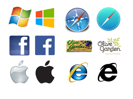 If you have noticed technology is growing faster by the minute. *Hold on. I had to do an update while I writing this, sorry about that* As I was saying, new apps, new algorithms and new platforms are being developed every day. With the thousands of developers creating millions of apps for billions of devices, there must be a way to get all these icons or brands to fall in line, to look cohesive on the same screen. The Widows 8 operating system uses color squares they call “tiles” to house all these icons. Each logo is striped down to a simple white flat version and incorporated into the color-coordinated tile. The application shortcuts all look like they belong together on the same interface, which make navigation easier. 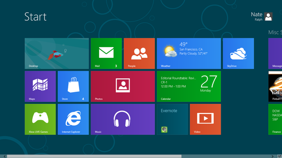 The demand for design has never been higher. Almost every product, project, or service includes print marketing, web, interface development, packaging, and social media campaigns. If a group wants to grow fast they need designers pumping out pieces at breakneck speeds, and something’s got to give. It would seem as though there isn’t enough hours in the day to give every design that extra value change or texture. The cleaner the design, the faster things can be produced. For someone with an artistic background, this is a real bummer.
It is my prediction as mankind and technology move forward, asthenic value of corporate design will be broken down even further, to the essence of forms and colors. This concept is portrayed in many of modern and postmodern art pieces; IE the essence of sculpture is a cube, let’s all stand around a gallery and admire at a box! It is the responsibility of the designer to take note of these design trends and adapt their work with the changing times. Although, I may long for the styles of yesteryear, the skillful, rich, gradient filled designs, I must pocket those tricks of the trade and make good designs without all those very special effects. Check out this link from Intacto to see who will win Flat Design or Realism! http://www.flatvsrealism.com/
0 Comments
Leave a Reply. |
OAKNOTESCategoriesArchives
February 2018
|

 RSS Feed